From Click to Convert: Transforming a Sign-Up Page with UX principles
PRODUCT DESIGN . @CAMPAIGN MONITOR

Summary
"Campaign Monitor is an email marketing SAAS platform that enables businesses and marketers to create, send and optimise email marketing campaigns.
This project was an experiment to test whether improving the marketing site through UX principles would increase sign-up rates and justify more improvements throughout the site.”
How it started...
When I first joined the company as a Product Designer, I noticed that the marketing website was rather outdated and could do with some improvements to the UX. So, I suggested the idea during a product workshop and led to more conversations with stakeholders. Turns out, our website had been slightly neglected since neither the Marketing Team nor Product Team felt a sense of ownership over the website.
I was tasked with proposing ideas on how to improve the overall website, starting the signup page. This involved collaboration between the Product Team, Marketing Team and stakeholders.
Hypothesis
We hypothesised that by improving the user experience (UX) of the sign-up page, we will observe an increase in the sign-up. Specifically, enhancements to the sign-up page's design, usability, and functionality will reduce friction in the registration process, leading to a higher conversion rate of visitors into registered users.
If this is true, we could improve other areas of the website too!
Current design

Take a look. What would you improve?
Design improvements
After evaluating the website...
1. Layout and hierarchy
-
The current background is intended to showcase previews of the “beautiful emails” our users can create. However, it appears faint and is overshadowed by the main form.
-
How can we improve the layout to better showcase email designs and entice users to sign up?


2. Responsiveness
-
The current design lacks consideration for mobile responsiveness, resulting in excessive spacing and email previews are hidden for users on smaller screens.
-
How can we optimize the layout to ensure responsiveness to maximise user engagement across all devices?

4. Social proof
-
Copy can be improved with addition of social proof.
-
Why? Proven to be highly beneficial in reducing perceived risk, increasing credibility, encourages action and again builds trust"
Success metrics
Here’s just a few of the success metrics we can measure:
Conversion Rate: Measure the percentage of users who successfully complete the sign-up process compared to the total number of visitors to the sign-up page. An increase in the conversion rate would indicate the effectiveness of our UX improvements in encouraging more users to sign up.
Bounce Rate: Track the percentage of visitors who navigate away from the sign-up page without taking any action. A decrease in the bounce rate would suggest that the UX improvements have reduced friction and encouraged visitors to engage with the sign-up process.
Time to Completion: Measure the average time it takes for users to complete the sign-up process. A decrease in the average time to completion would indicate that the UX improvements have streamlined the sign-up process and made it more efficient for users.
The "final" design

3. Social sign-up
-
Currently lacking social signup functionality
-
Why? Research has shown that social sign-up can improve security, user’s trust, cross-platform compatibility and reduce signup time.

Next steps
-
Once implemented, we will measure our success metrics to gauge the impact of this design. If our hypothesis was correct, this will pave the way for future enhancements across other areas of our marketing website (effectively expanding our scope of work).
-
This project was particularly intriguing as it highlights the importance of workshops and close collaborations across teams.

Features
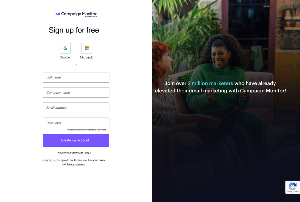
The proposed design has a "split screen" layout, allowing users to clearly view the previews of emails on the right.
Designed with all screen sizes in mind, the responsive design enables users to view the email previews on mobile and tablet. Spacing has also been optomised to show information above the fold compared to the current design.
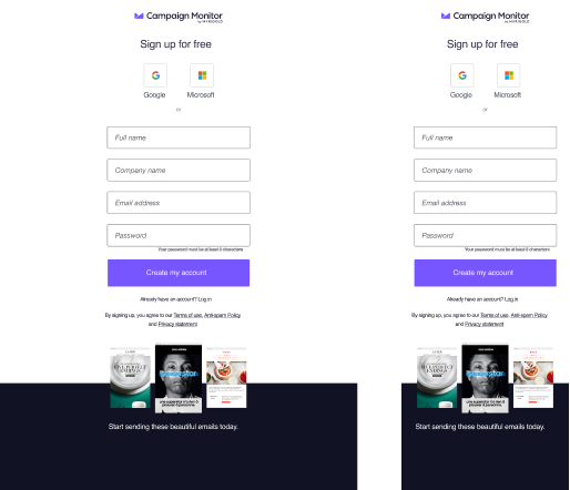
Addition of social sign-up. However, this would require some tech effort.
A version displaying social proof will be A/B tested to test the effectiveness of social proof.